Category: Software Engineering
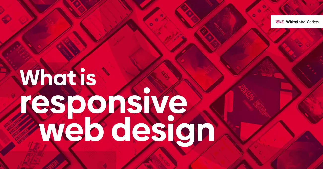
What is responsive web design?
For some years now, smartphones and tablets have been conquering the market and gaining great popularity. Mobile devices are now not only used to communicate with other users, as was the case a few years ago, but they are a necessary tool used every day for shopping, paying bills, surfing the web, etc. Therefore, responsive web design has become a trend.
And because the Internet is increasingly often accessed from mobile devices, it would not be very sensible to have a static website design that only looks good on PC computer screens. Therefore, we need a smart web design to be sure that the website looks and works well on all smartphones, tablets, laptops, and desktop screens. We need Responsive Web Design. Moreover, we need Mobile First Design. And we may even need Full Page Scaling.
Web Design
The most important rule in website design is not to overdo it. We can have some fireworks in the desktop version, but also not too extreme. The statistics of popular devices and resolutions, for example, https://screensiz.es/monitor, show that not every device has 16GB RAM, a super-powerful processor, and allows you to comfortably play in “Cyberpunk 2077”.
Websites should load fast, preferably lightning fast. They cannot be bugged, have elements that cannot be clicked (although they should be clickable) or not fit on the screen. In the case of a store, we need to be sure that the shopping cart works and that the customer can complete the transaction.
The website should obviously look good on all mobile devices, tablets, and desktops, so as not to lose users, who want to visit a website, or customers, who want to buy from a store. Therefore, the website should be responsive.
Responsive Web Design
With responsive web design, websites and stores can adapt to the requirements and resolutions of the device screens and provide the best experience to users whether they’re are using desktop computers, laptops, tablets, or smartphones.
What does responsive web design mean?
Responsive web design is a web design approach that allows all websites to display perfectly on all device screen sizes and resolutions by automatically adjusting the website whether it is a desktop, laptop, tablet, or smartphone.
How does responsive web design work?
It uses the combination of HTML, Cascading Style Sheets (CSS), and various settings to control the content in any web browser and to deal with different screen sizes, orientations, resolutions, colour schemes, and other characteristics of the user’s device.
Why is responsive web design important?
Responsive web design allows to avoid hassle of working on many website versions for each and every device that is used. It is also important from a cost perspective, as it allows developers not to make changes to every possible website/store version.
Why should you use a responsive web design?
With the responsive web design approach, all images, fonts, and other HTML objects are scaled and maximized according to the size, resolution, and properties of the screen.
But as we already know, the number of mobile devices is constantly increasing, and that we can only win with well-designed responsive website version. Therefore, when designing a mobile website, we should consider several factors, such as:
- mobile devices do not use a mouse,
- the website should be simple, clear, good-looking, and not daunting. The use of effects, such as gradients, css filters, js animations is not recommended to not to overcomplicate the website,
- all elements of the website should have an appropriate size, so that the user can easily click on them,
- all icons and details should be in svg format because it is small and scalable,
- graphics should be used only where they are really needed (e.g. because they show our product).
But to take a step forward and stand out on the web, we should take into account the increasing popularity of the mobile devices and perhaps start designing the website for them.
Mobile First Design
Mobile First means that we start web/store design from the mobile end (with the most basic functions and features) and then expand it to the tablet and desktop versions by adding advanced functions, interactions, and more complicated effects. And because we can safely assume that the mobile version will be the most popular, it will make a great base for other website designs.
Mobile First Design is about Progressive Advancement approach to the website/project. In practice, we start the website design with the mobile version, e.g. with the most popular width of 320px, then we expand it to 768px for tablets and e.g. 1920px for desktop.
The old approach to website design – called Graceful Degradation – assumed the degradation of the desktop version to the mobile one. This meant that we would start the design from the desktop version, say 1920px, and then use it to create a mobile one.
This approach is still used today. However, I recommend using the Mobile First approach whenever possible, because it offers significant advantages, such as faster loading speed. It results from the fact, that mobile website version loads only the functions it needs, without, for example, css styles used in the tablet or desktop versions or js scripts.
Example: a slider in the desktop version can be a banner with smaller graphic objects in the mobile version.
Example with an explanation:
.desktop-widget {
	display: flex;
	display: flex;
	align-items: center;
	justify-content: center;
	color: rgba(0, 0, 0, 0.6);
	font-family: „Roboto”;
	font-size: 1rem;
	font-weight: 500;
	line-height: 1.2;
}

@media (max-width: 1199px) {
	.desktop-widget {
		display: none;
}
}
The above code is a widget that loads all styles on a mobile device. It is hidden with Media Query for the resolution below of 1200px. But if we have more such objects on the website, then all their styles will be loaded.
Example with an explanation (Mobile First approach):
.desktop-widget {
  display: none;
}

@media (min-width: 1200px) {
  display: flex;
  align-items: center;
  justify-content: center;
  color: rgba (0, 0, 0, 0.6);
  font-family: "Roboto", arial;
  font-size: 1rem;
  font-weight: 500;
  line-height: 1.2;
}
In this case, the mobile device loads only the command to hide the widget without the widget styles.
As I mentioned earlier, there are significant benefits of this approach, such as faster loading speed, which is especially important for overall Google scoring. And we all know that the higher the scoring the better.
Full Page Scaling
In the second half of 2020, a new trend emerged – Full Page Scaling. And I believe it will become more and more popular. With this approach the website does not have to look the same for every version, from mobile to desktop, as this may be impossible or simply unreadable due to the design.
I’ll briefly describe what such an implementation looks like using a recent project as an example. We were given three views in, let’s say, standard resolutions: 320px (mobile), 768px (tablet), and 1920px (desktop). Each of them had to be designed in Pixel Perfect mode.
Pixel Perfect
“Pixel Perfect” consists of reproducing exactly the design of the website given by the client/designer, for example 320px, 768px, and 1920px. Although it is not a rule.
Our task is to implement the design with tools as PixelParallel by htmlBurger or PerfectPixel by WellDoneCode. Intermediate resolutions, e.g. 1280px, 1366px, or operating systems with different screen scaling by default can be a problem. In this case, we do not have intermediate views, so we can use breakpoints without scaling the website. It allows to keep the “Pixel Perfect” mode only for given resolutions or for scaling the webpage with, for example, rem units as CSS values and calc for the HTML tag. It allows not to lose the “Pixel Perfect” mode for intermediate resolutions.
Of course, small differences may occur, e.g. due to the scaling of the screen. Using “Pixel Perfect” certainly means more work, as everything should be carefully prepared and the values from Figma, Adobe XD etc. are not enough. So adjustments are necessary, for example by 1px, to fit the design to the website.
With the above guidelines, I had to rethink how to approach the project as a developer. Using a library like Bootstrap, or Tailwind, etc. was not a good idea with the above guidelines. Besides, we have already built so many websites based on these libraries that we do not need another one. And I will not go into pros & cons of the above libraries, because that is not the point.
I decided to base all views on CSS grid and flexbox. Browsers handle them well, both mobile and desktop ones. Following the “Mobile First” approach, I prepared a “Pixel Perfect” view, starting with a resolution of 320px. When writing the styles, I used “rem” units to be able to scale virtually anything with font-size and calc for the html tag. Between 320px and 767px for mobile view. Then 768px to 1199px for tablet view and from 1200px to resolution of 4K for desktop view. I wanted to use the 1280px resolution for desktop view. It worked from 1200px and the effect, believe me, was great.
Everything scaled nicely with practically three breakpoints. I also used the units “%” for the container and “vw” for the <h1> tag, because it was quite big and needed correction. Besides, with “font-size: … rem;” it was just too small for intermediate resolutions.
The question is how much time I saved by ignoring intermediate resolutions like 1024px, 1366px, 1440px, 1680px etc., how many lines of extra code I saved, and how it affected the page loading speed? It’s hard to answer this question accurately by giving the values in numbers, but I think that in the case of this project it might be around 40 hours of work.
Some examples of scaling for different resolutions.
1200px

1366px

1680px

1920px